Diese Anwendung benötigt für ihren fehlerfreien Ablauf Cookies. Cookies sind kleine Textdateien, die von einer Webseite oder einem Online-Dienst auf Ihrem Rechner gespeichert werden. Nachfolgend erhalten Sie eine Auflistung der von OCLC verwendeten Cookies mit Angabe des Anbieters, einer Kurzbeschreibung und der Speicherdauer auf Ihrem Computer (sofern Sie diese nicht sperren oder löschen). Es werden keine personenbezogenen Daten erhoben.
zur erweiterten Suche
Sie befinden sich im Bereich des Online-Kataloges (Web-OPAC) Ihrer Stadtbücherei.
Stadtbücherei geschlossen:
Freitag, 05.07.2024
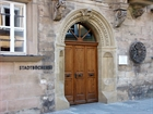
Stadtbücherei Coburg
Herrngasse 17 96450 Coburg